
The city of Akron unveils new logo honoring rubber workers
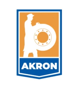
Akron, OH – During Akron’s Mayor Horrigan’s last State of the City address, he unveiled a new City of Akron logo. The logo prominently displays an outline of the Rubber Worker statue, as well as, “AKRON” in bold letters, encapsulated in a chevron shape. It also features 10 lug nuts in the center of the tire to represent the 10 wards of Akron. The logo was announced via a video produced by Akron’s Pritt Entertainment Group.
“This logo represents the most important thing about Akron: its people,” said Mayor Horrigan. “It embodies all those qualities that were essential to the rubber workers of years past: grit, determination, risk-taking, passion, fighting spirit, diversity, and resilience. These are the same qualities that run through the blood of Akronites to this day and for that reason we felt this was the best symbol to lead Akron into a new day.”
The image and the city’s branding guideline were created by the city’s Communication and Media Supervisor, Jake Bell. Bell, an Akron resident, based the logo off the city’s Rubber Worker statue as his inspiration.
“After a comprehensive review of the City’s external and internal communications, we determined that consistent branding and a fresh, new logo would help streamline our communications and City designs,” said Jake Bell. “I am honored to have been tasked with creating a new City logo that pays homage to Akron’s past while reminding of us of the spirit of determination in each Akronite’s DNA.”
The 12-foot tall, bronze Rubber Worker statue sits atop a tiered granite base at the intersection of Main and Mill streets in downtown Akron. The statue was created by Ohio sculptor Alan Cotrill and was installed on May 11, 2021. Cotrill based the statue from the image on the cover of David Giffels and Steve Love’s book “Wheels of Fortune.” Learn more about the statue here.
While the statue and the logo certainly pay homage to all those who helped build the city and the rubber industry, they also unite the past and present through those qualities that defined the rubber workers. Often forced to work in harsh conditions, rubber workers led strikes to fight for the future they wanted. Many of those in the rubber industry came to Akron from faraway states and even other countries to take advantage of the opportunity that hard work creates. They were diverse. Black employees and women were often forced to take some of the worst jobs in the industry at lower pay to keep the tires rolling. Their contributions were integral to building up the industry and the city, and their unique efforts are commemorated with plaques near the statue in downtown Akron. These workers were passionate, gritty, determined, and unafraid of a new challenge. It is these same qualities at the core of all Akronites that make Akron the city it is. Each person who calls Akron ‘home’, no matter the age, race, gender, profession, upbringing, or heritage can see themselves in this image.
The branding guide released today explains the colors that the City has chosen as the official color palette, appropriate uses and use case examples, font, branding applications for internal use including email signatures, Powerpoint templates, cover letters, and more.
“Unifying the city’s communications efforts under one umbrella has been a goal for my team since we stepped into these roles,” said Chief Communications Officer Stephanie Marsh. “Giving Akron a new, modern logo and a unified brand guide to help steer its use and application are truly just the first step in that process. The next step will be an updated city website which will be intuitive, user-friendly, and much more functional than our current site. We are excited to launch that this summer.”